UI and UX Development
December 6, 2020
Automaton could be a difficult game to enjoy if the gameplay experience is too confusing, too complex, or too cumbersome. To ensure that its easy to understand and play I've conducted a lightweight design sprint.
Game System Concepts
The game introduces concepts that should be familiar to anyone who has played an RPG before. However, the concepts go by new names in Automaton and some of them are slightly modified. The most basic concepts are the following:
- Tools: any command used for interacting with the game world outside of battle mode
- Programs: any command used to attack opponents (e.g. weapons)
- Daemons: programs installed to defend against attacks from opponents (e.g. shields)
- Files: data used by the player and by programs (e.g. keys)
- Components: the hardware used to run all the software above (e.g. a character class and level)
- Agents: other AI characters that may be allies or enemies (e.g. NPCs, bosses)
- Nodes: other devices connected to the network (e.g. shops, treasure chests, and energy sources)
- Networks: collections of network nodes that are all locally accessible (e.g. towns or world maps)
- Crypto: money. What kind of self respecting AI hacking game would use anything but cryptocurrency to represent money?
The basic gameplay objective is to gain and hold power by taking over energy sources connected to the network. To accomplish this goal, the player must overcome enemy AIs who have the same objective. To overcome these enemies, the player uses programs to submit large amounts of malicious network traffic to enemies. This makes the battles a competition of rates of compute processing. So a player is always seeking more efficient programs and daemons for upcoming battles.
Gameplay Design
Games present a player with a collection of tools to address a sequence of challenges. The player learns and builds skill through iterative play. Like any other RPG, Automaton has three high-level feedback loops described as "modes":
- Exploration Mode: the player tries to find improved programs, weapons, data, and host hardware
- Development Mode: the player configures data, programs, and daemons in preparation for upcoming battles.
- Battle Mode: the player pursues a strategy of attacks and defenses to win the battle.
These names are provisional. I'm still considering alternatives that better match the game themes. Anyway, I created a diagram that shows how these feedback loops fit together:

Each of these feedback loops (or modes) is composed of a set of player intentions. Each intention can be satisfied by an action and a corresponding command. A player needs to have a specific set of information to choose the actions that meet their intentions. I constructed an audit of every action needed to support each intent for each feedback loop. The information for each decision is broken down into three categories:
- Options: for a player to make a change, they must first query options to target (programs or dameons to equip, network nodes to visit, etc)
- Constraints: most changes have limits that will constrain a player's options (memory capacity for loading programs, CPU time needed for executing attacks, etc)
- Considerations: a player may need to balance multiple factors against one another (program efficiency vs memory requirements)
Using this framework, I documented the UI views needed to present these categories of information.
Interactive Design
One of the most peculiar aspects of this game is that it is meant to be played using a keyboard only. This would be jarring for a normal gamer. But the ideal target audience includes developers who often work this way. Furthermore, I consider it to be part of the appeal for a game about hacking AIs. But regardless, given how strange this may be to some users, I've decided to design full support for D-pad control as well. So any command that might be typed could also be constructed as a sequence of selections from lists of options (the same way code hinting works using a developer IDE).
User Interface
One of my greatest inspirations for a keyboard-only UI is Unix. I found a handy transcript of the original Unix Command Language paper authored by Ken Thompson in 1976. The updated transcript is such a delight to read. It also puts the Unix CLI design patterns in context with the state of the art in the 70's. I plan to emulate this same structure with user-submitted commands in Automaton.
Commands are submitted with an input field using the following format:
command arg1 arg2 ... argn
Each program is dedicated to one of the aforementioned user intentions. For example, all program management activities is governed by the ps program. The arguments may act as modifiers or as targets. Targets can either be a special alphanumeric ID presented as part of list views, or it can be the full name of a target entity. In either case, the target must match the expected type for the command. For example, the command ps load [target] must uniquely identify a program for the [target] argument.
If the user is relying upon the D-pad instead of typing in commands, the up or down arrows will display the full list of options given the current command string. If the command string is empty, it will display a list of all tools and programs that may be used. If the next argument is expected to be a target program, a list of target programs is presented instead.
Views
With the aforementioned audit of feedback loops, I defined the views needed to present the user with right information. There are two primary types of views: list views and detail views. There are two variants of these view types that show local or remote information. These views are required for the six core game concepts: programs, daemons, files, components, nodes, and networks. For node and network objects, there may be a limited detail view. My plan is to ensure that no single view requires pagination but if that becomes too impractical, it can be added. The minimum fields needed for each game concept are listed below:
- Programs: name, description, data type, encryption type, efficiency, memory size, version, and access rights
- Daemons: name, description, data type, cycles (or cost), memory size, version, and access rights
- Files: name, description, source, disk size, version, and access rights
- Components: name, description, subsystem, type, power, datarate, capacity
- Nodes: class, network, power output, kernel, status, load factor, components, gateways
- Networks: name, description, nodes, gateways
Layouts
The views are not presented in isolation. Instead the views are collected together to form a type of dashboard that supports player intentions and decision-making. Layouts are determined by the intent associated with the most recent command issued by the user. The layout will present the views with the information needed for the corresponding decision to be made. After performing an audit of all the commands available to a player and constraining the display to three views (or less), I determined that there are five layout types:
- Layout A: two list views and one detail view - useful in Development and Exploration modes for configuring the player character
- Layout B: one list view and two detail views - useful in Development mode for equipping the player character
- Layout C: one list view and one detail view - useful during Exploration mode
- Layout D1: two list views and one detail view but for Battle mode only.
- Layout D2: two detail views and one list view but for Battle mode only (like D1).
Wireframes
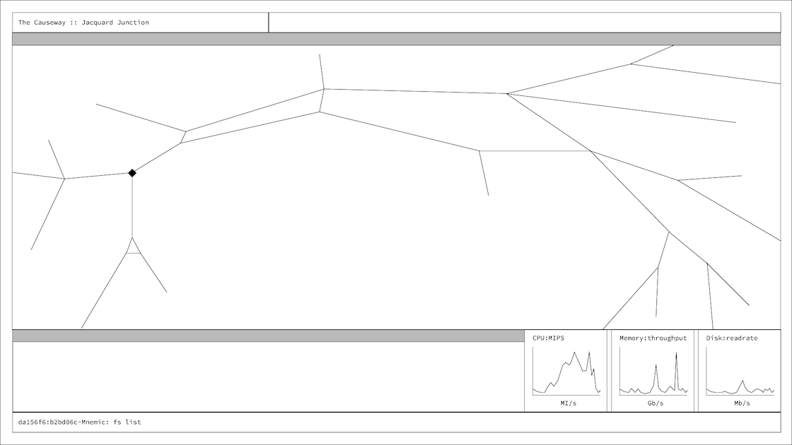
I started prototyping the interactivity first with sketches on paper. I soon found that I needed to present realistic, in-game textual information for the interactivity to be representative of the experience.
To do this, I created a ficticious game sequence based upon a pre-defined list of commands with expected output. The output was organized into two or three views per command based upon the feedback loops, intentions, and actions described above. The following list of commands is an example of the format:
| Command | View 1 | View 2 | View 3 |
|---|---|---|---|
| fs list | List of local files | List of backup files | System summary |
| fs open [file1] | List of local files | Opened file [file1] source | System summary |
| fs open [file2] | List of local files | Opened file [file2] source | System summary |
| fs list | List of local files | List of backup files | System summary |
The following wireframes demonstrate the previous sequence of commands:
Visual Design
The ideal case for the visual design is a good quality rendering of a style that fits the gameplay themes and matches the preferences of the target audience. In particular, I'm interested in presenting the information in a manner that is easy to understand but feels more exciting and exotic. I started by conducting some research and finding sources of creative inspiration.
Research and References
As part of my research, I discovered that multiple online galleries of game UI interfaces exist (here and here). However, these were not particularly illuminating for me. I stumbled upon the personal blog of Christopher Noessel, scifiinterfaces.com. He's got some strong opinions about movie GUIs! His site also has a large index of fictitious movie UIs that I found useful.
I was more interested in a couple of text-only cyberpunk themed games, Cogmind and Polybot-7, created by indie game developer Josh Ge. I love the style of these games and they've made me seriously consider using a text-only rendering using a custom tileset. Although, at this point, I'm moving forward as planned.
Another interesting reference that I found unexpectedly on Hacker News was a blog post by Jacob Zelko that detailed his CLI-based workflow. It was inspiring in part because it reminded me of another approach to organizing interactive views that is used by tmux. I haven't used tmux in a long time but its also a popular developer tool for CLI-based interfaces.
Typography
I wanted to be able to support a monospaced font for two reasons. First, its more true to life because developers primarily work with monospaced fonts (so as to keep spacing consistent). Second, I wanted to be able to support large character grids for tabular data and monospaced fonts would look more consistent visually. After some searching I considered the following options:
- Hack from Source Foundry
- Deja Vu Sans by Štěpán Roh
- FiraCode by Nikita Prokopov
- Plex by IBM
I've selected FiraCode because I think it's the most versatile. It looks good in all caps and at a variety of sizes (I want to have a few instances of text at larger sizes). The ligature support in FiraCode is really quite nice. I personally like it so much that I installed it for use with Atom. This font also works well enough in Godot (even though Godot won't render the entire character set or the ligatures).
Mood Boards
During this same period of time, I sought out movie interfaces as references as well. There's a sizable amount of business in the world of VFX for "screen graphics" which are fictional UIs designed for cinematic effect. Given that these UIs are purely fictional, they need not be functional. But in my experiece, people tend to see movie interfaces as the most interesting and attractive. I've certainly felt that way in the past for movies like Oblivion. I found a collection of professionally designed UIs in portfolios from Gmunk, Ash Thorp, Ryan Close, and Evgeny Rodygin. These guys all have exceptional work and their portfolios gave me inspiration for putting together a little mood board:
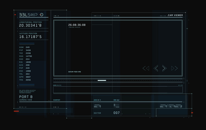 The Oblivion Light Table by Gmunk
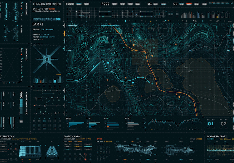 The Halo Wars Holo Table by Gmunk
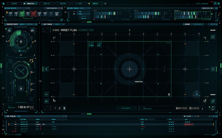 Screen Graphics by Evgeny Rodygin
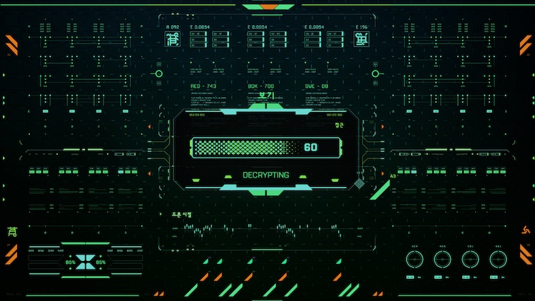 Apex Legends loading screen Ryan Close
I actually tried to create something that reflected these mood boards but after about a day I decided it wasn't quite worth the effort. I was once a professional graphic designer (in college) but I discovered that I was unlikely to become competitive in this field. Those memories all came rushing back from this experience. For now, I'll have to keep the visual design simple for the sake of launching.
Next week, I'll be focused on creating a real version of the UI which will include a CLI input system for issuing commands. Stay tuned!